
The original Crest 3D White packaging uses a purple and blue color palette with a sparkle effect. While the overall design is successful in consumer marketing, the color choice is arguably unrelated to the flavor, and the design could be simplified.
For this redesign, I wanted to explore new, fun flavors that consumers could mix and match. Rather than experimental flavors marketed solely to children, my redesign would cater to various age demographics. With a smaller tube, consumers could test out these new flavors without committing to a larger amount. The packaging would be constructed with a single dieline, making the construction simple and sustainable. The design will utilize a minimalist, geometric look with complementary colors that flow across the entire package.
Inspiration Board
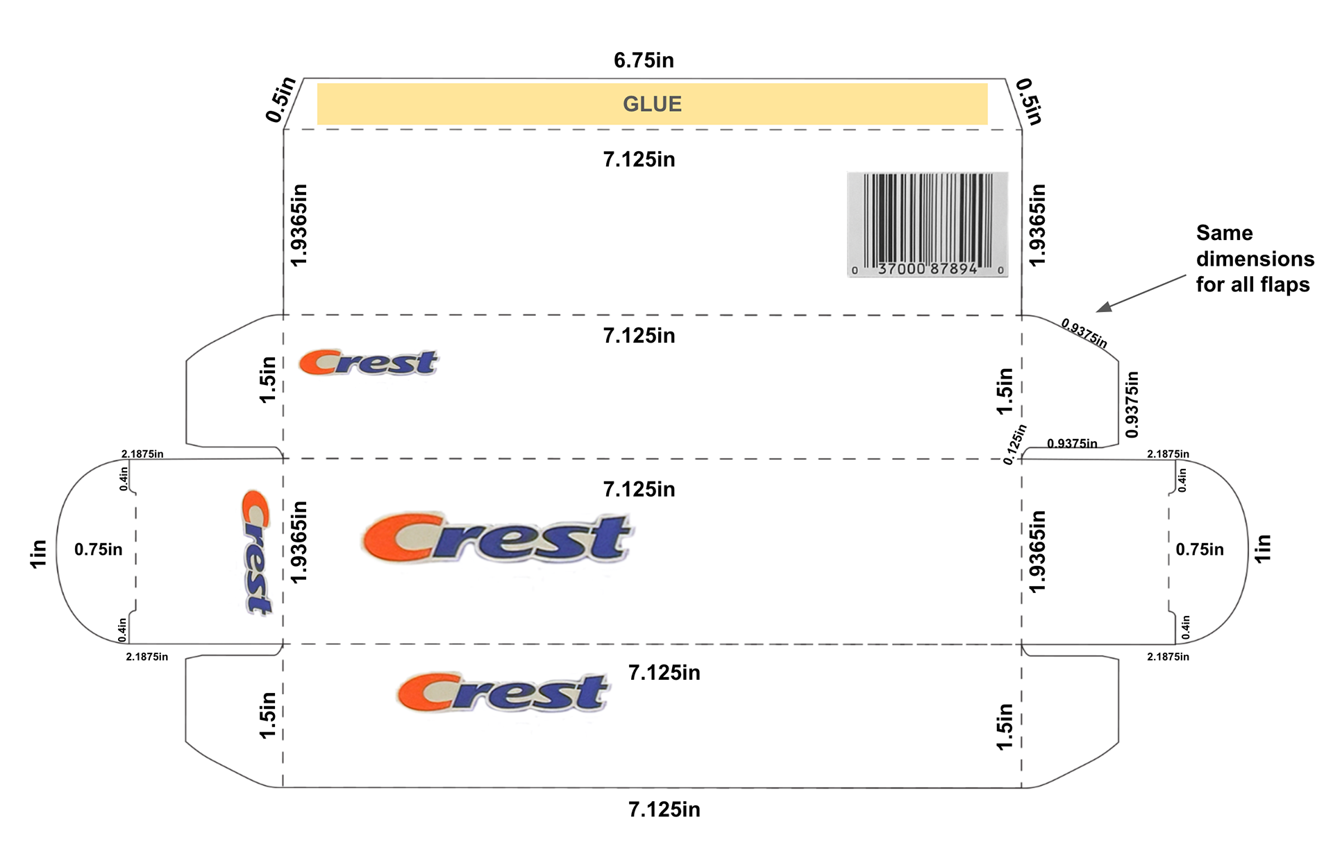
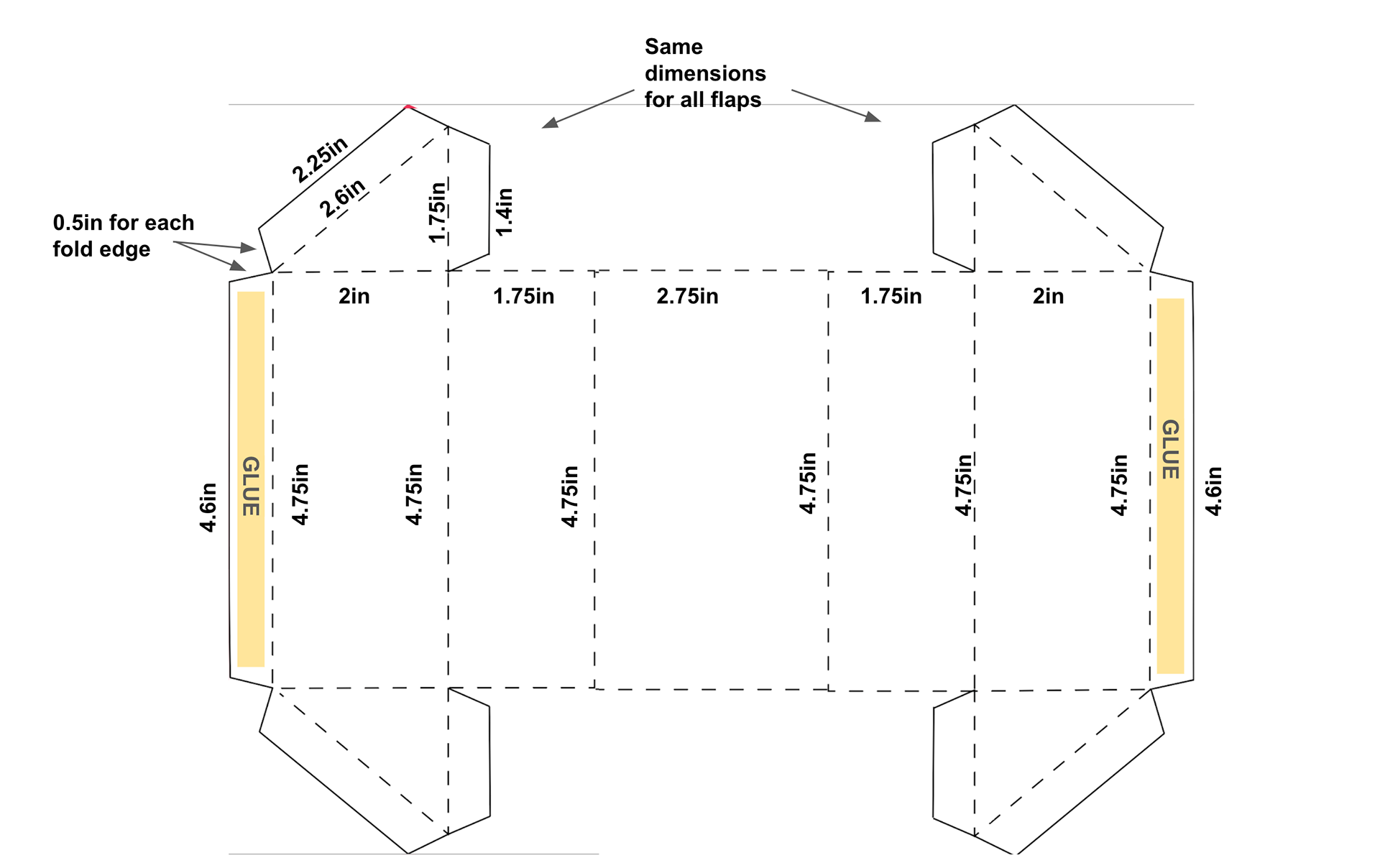
Original dieline vs. New dieline
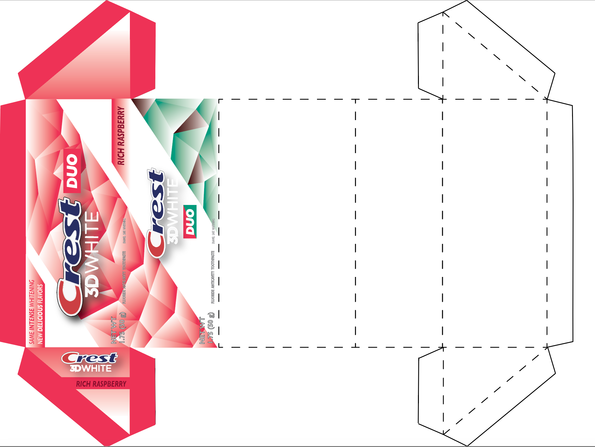
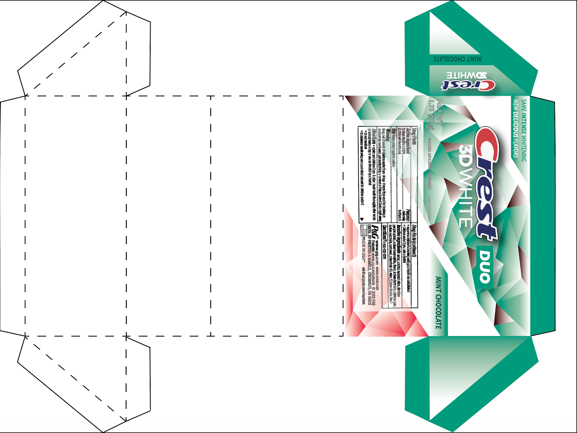
Final dieline design
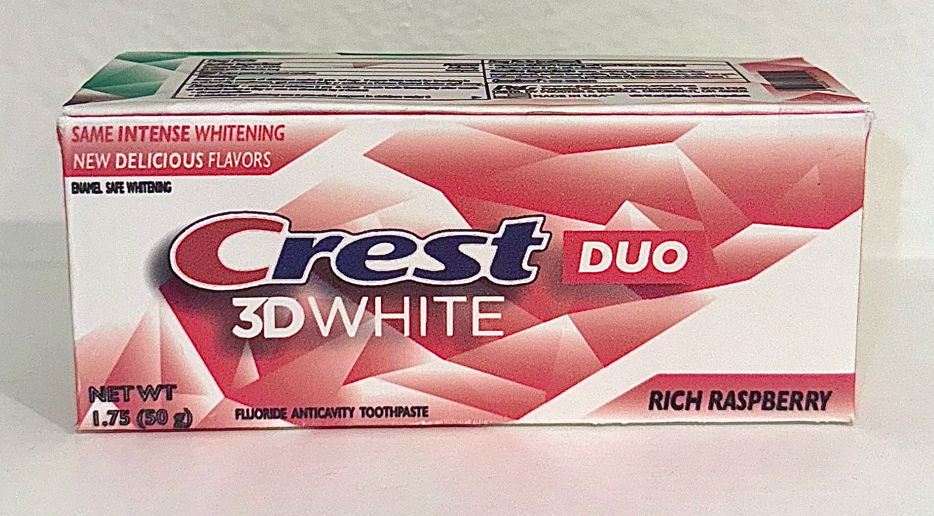
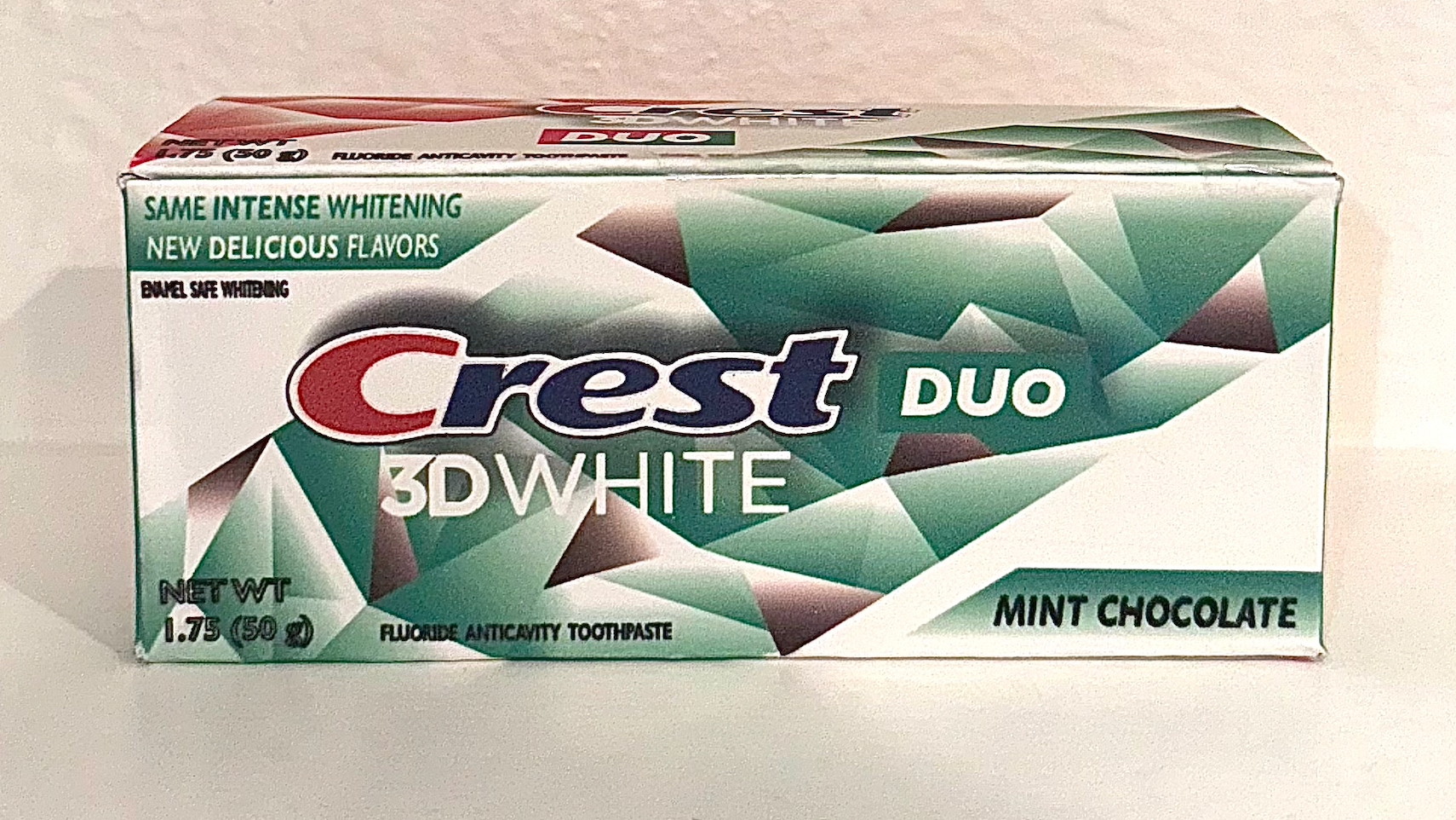
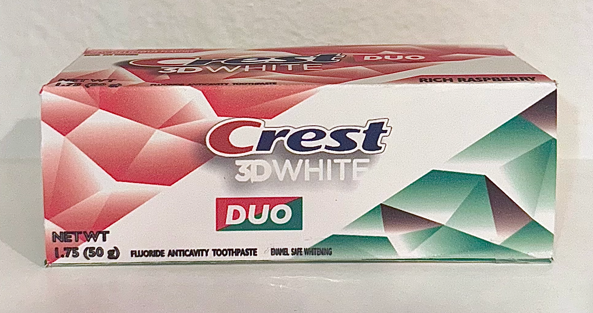
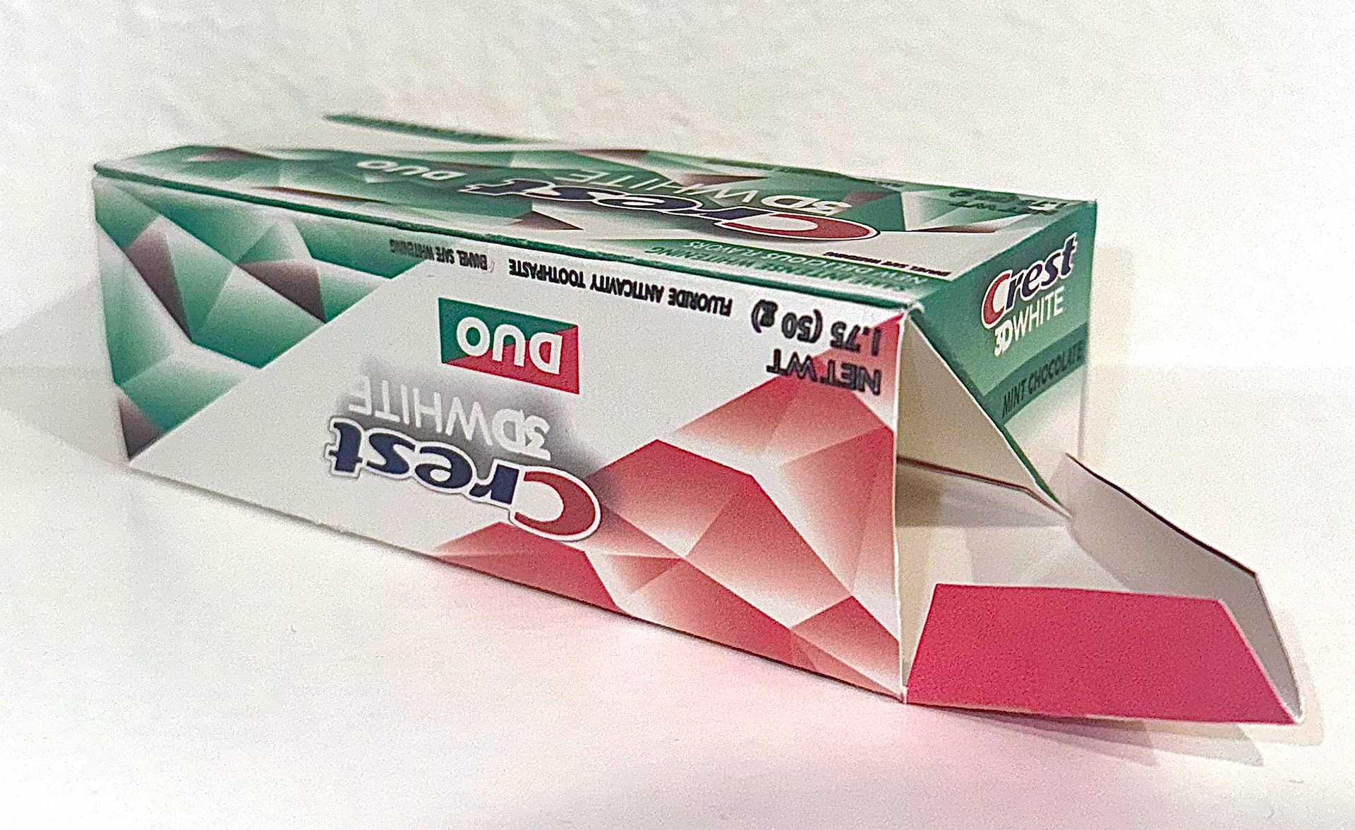
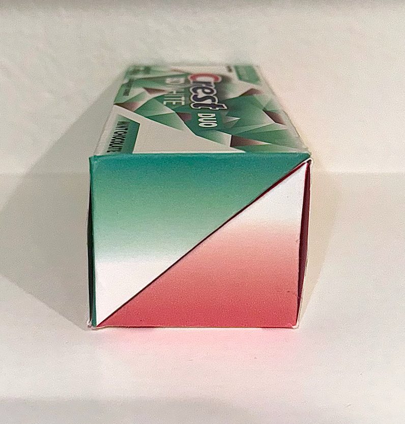
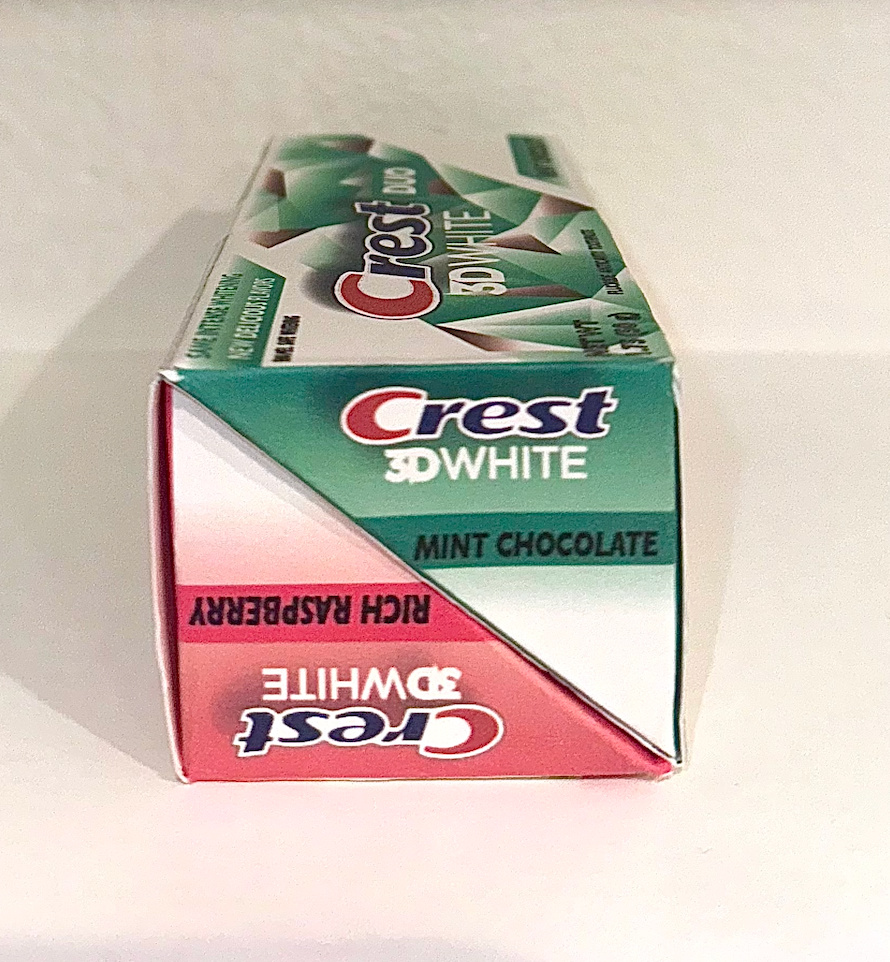
Final design

